
Approaching the Exhibit

VISITOR’S OBJECTIVES
- Find the entrance and walk over.

We designed and validated the digital layer of the Macroverse around how kids learn, play, and engage.
Our work lays the groundwork for Discovery Cube to continue building the exhibit from a research-backed foundation.


It’s not important if our guests know the definition of these character traits - they’re big, chunky words! What matters is that they have a great time in the Macroverse, make amazing memories with their friends and family, and actively do these traits as they interact with the exhibit. We want every guest to be inspired to embody good character when they leave the Macroverse and the Cube. The words aren’t important, it’s people’s actions that matter.
-Laura Schmidl, Director of Education, Discovery Cube
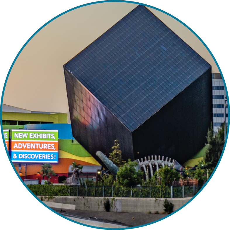
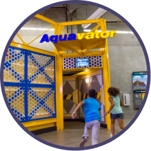
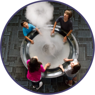
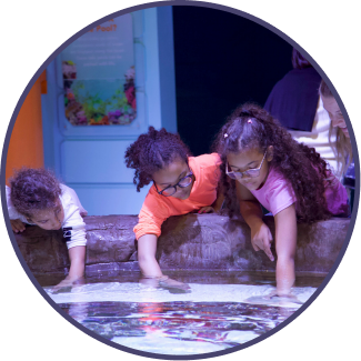
A non-profit children’s science museum in Santa Ana, CA. Unlike typical museums, the Cube aims to inspire and educate visitors through highly interactive, science-based experiences.
As a pillar of the community, the museum’s strives to educate and empower the surrounding community by building character through STEM initiatives.

Who We Are Designing For

School Aged Children

Parents and
Guardians

Accessible Across Reading Levels
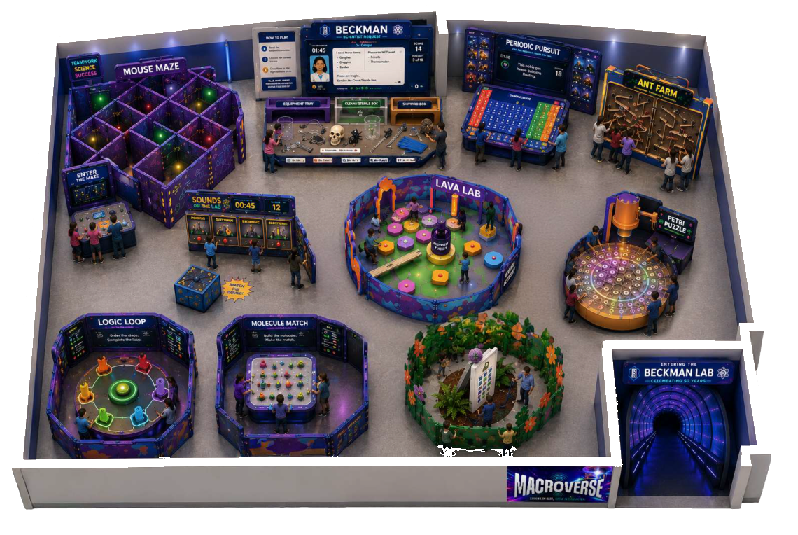
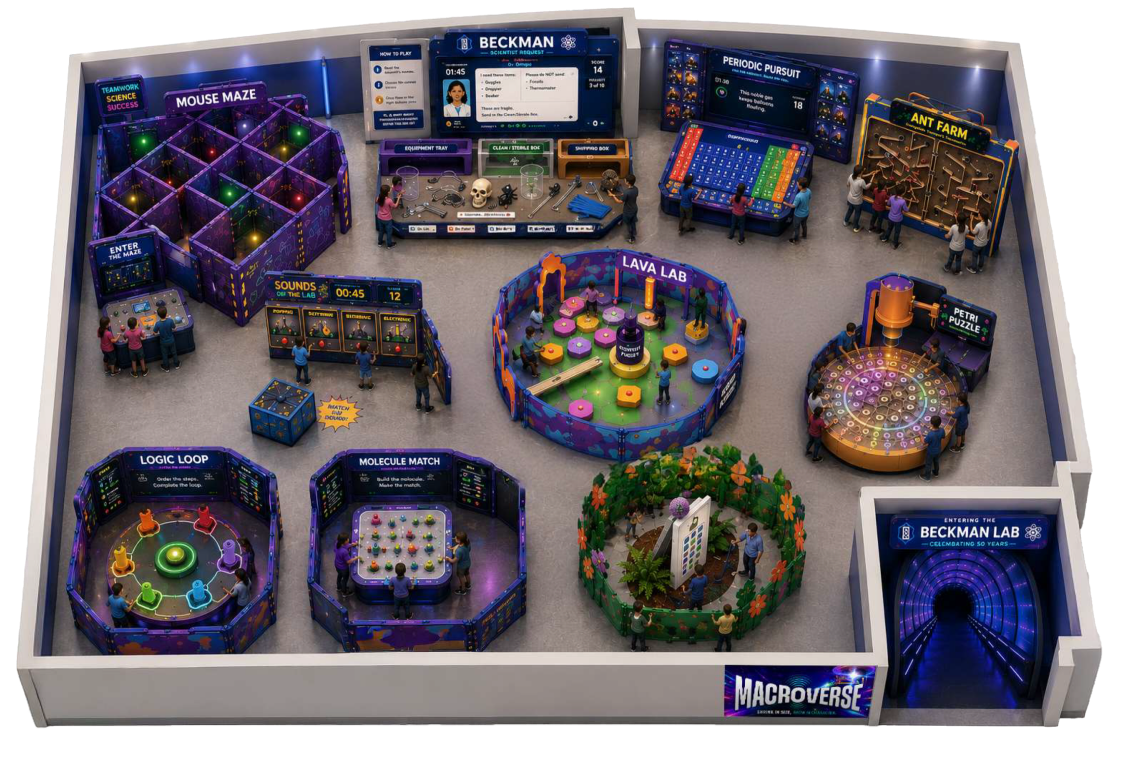
Launching May 2027, the Macroverse will take over Discovery Cube’s 30,000 sq. ft. second-floor showroom as a new seasonal exhibit.
Visitors are “shrunk” to the size of a lizard and challenged to grow back by completing mini-games and earning character points.
Along the way, visitors practice four character traits: being dynamic, curious, collaborative, and tenacious—putting each into action through play.
To get the full picture, let’s go through the exhibit as if you were a visitor!
You will interact with the touchpoints we designed, as well as the full picture of when and where these occur!
Approaching the Exhibit
VISITOR’S OBJECTIVES
Onboarding
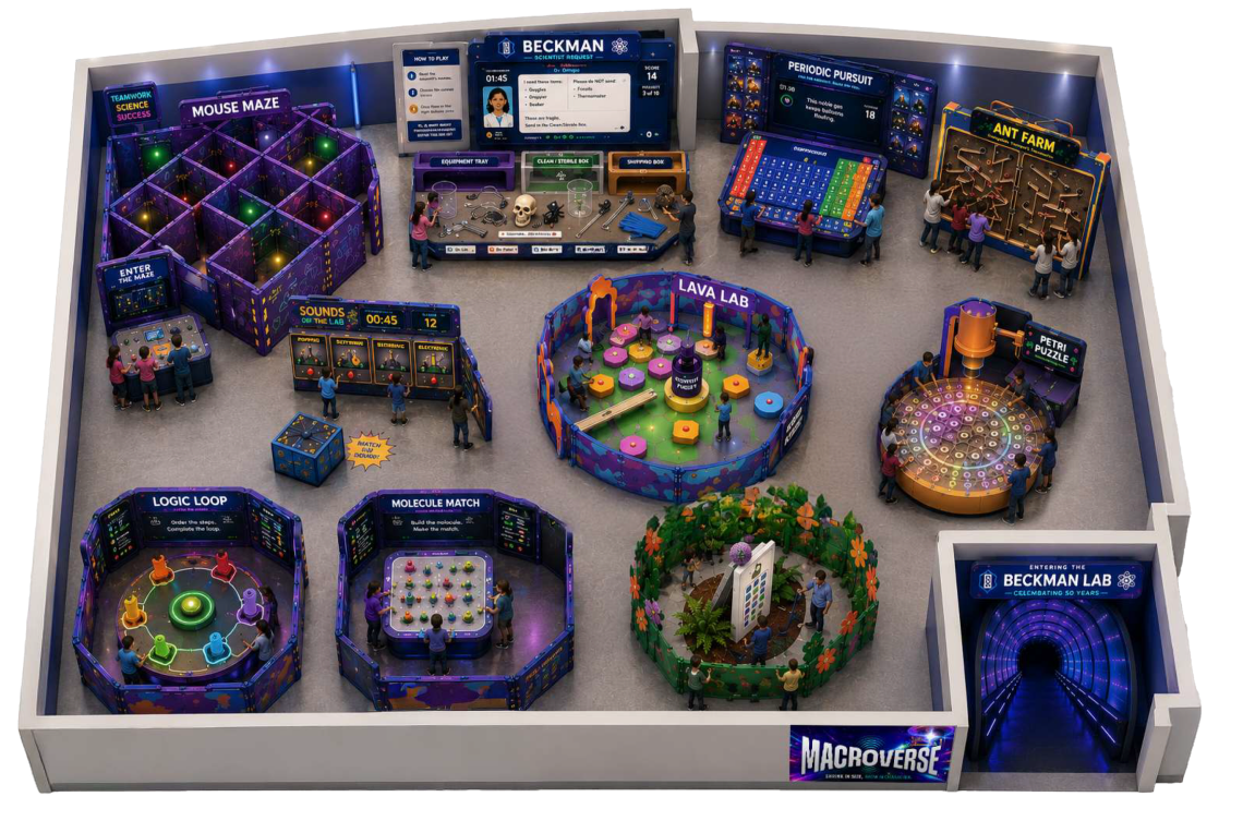
Onboarding Stations Located Here!
VISITOR’S OBJECTIVES
SYSTEM OBJECTIVES
Get Shrunk!
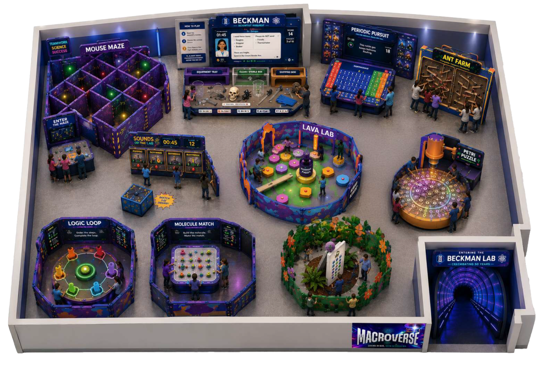
VISITOR’S OBJECTIVES
Play the Games
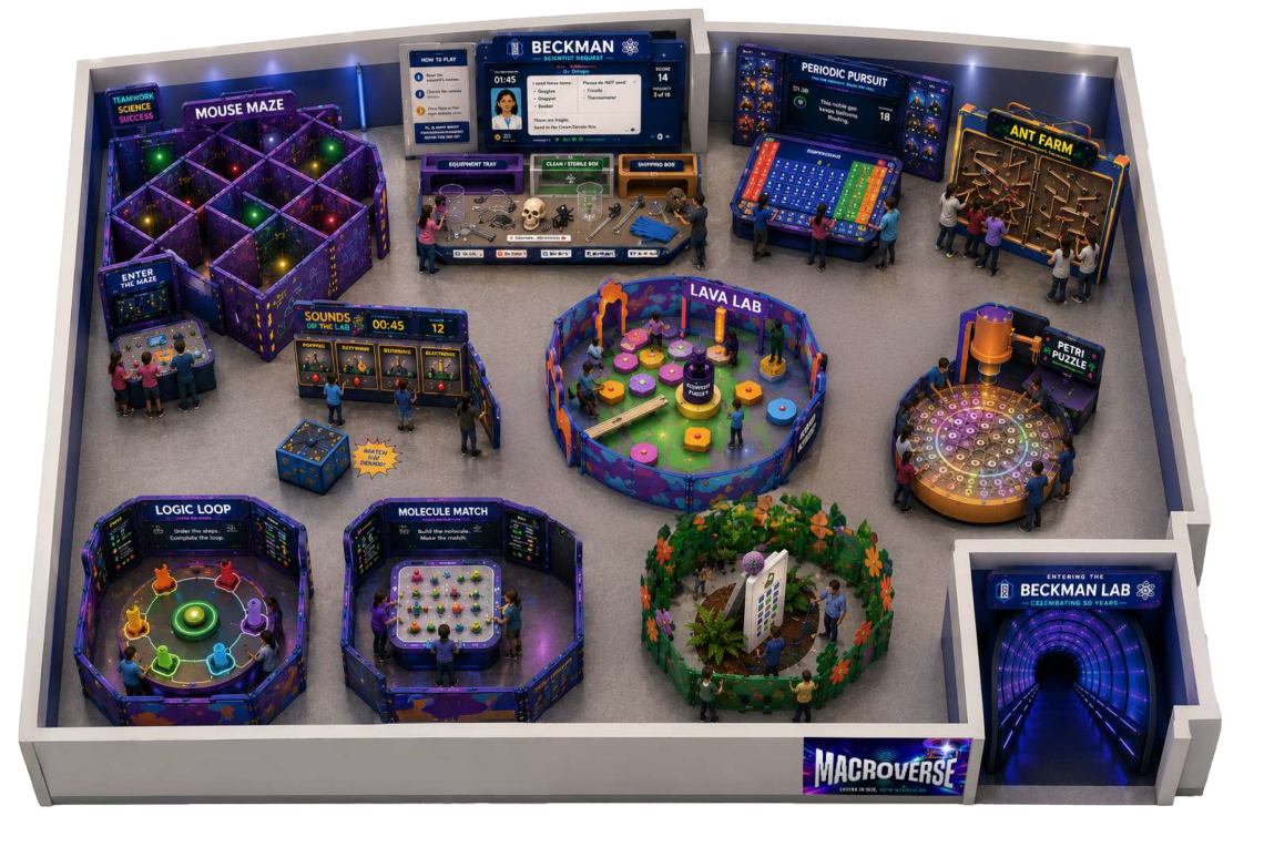
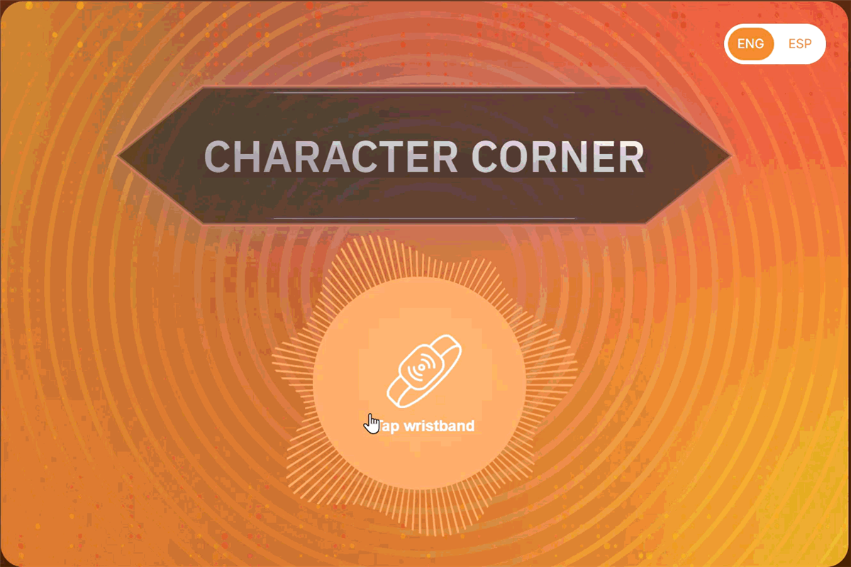
Game Check-In In front of every game!
VISITOR’S OBJECTIVES
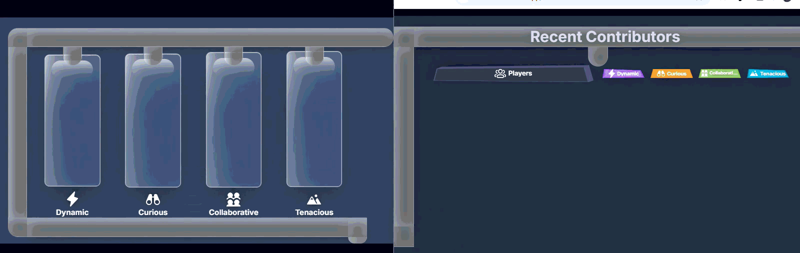
SYSTEM OBJECTIVES
Donate Your Points
Contribution Kiosks
VISITOR’S OBJECTIVES
SYSTEM OBJECTIVES

Things we found out!
...and how these helped make our decisions
Let’s get into these details. They’re juicy.


Control Information Density
Through testing, we learned it wasn’t about giving users less information, but the right information at the right moment.
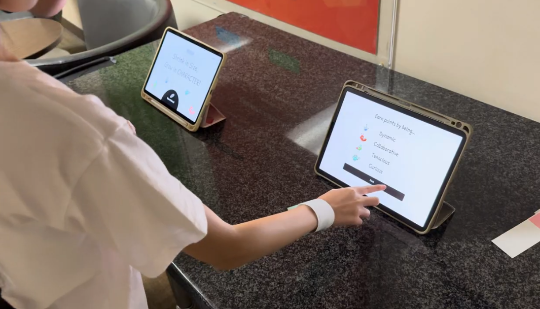
Denser information requires more time to absorb.
ORIGINALLY ! We thought reinforcing the traits at onboarding would help visitors understand how to embody them.
IT DID, but.... It took SO long. Valuable for learning, not so great for crowd flow.
So we cut it all out.
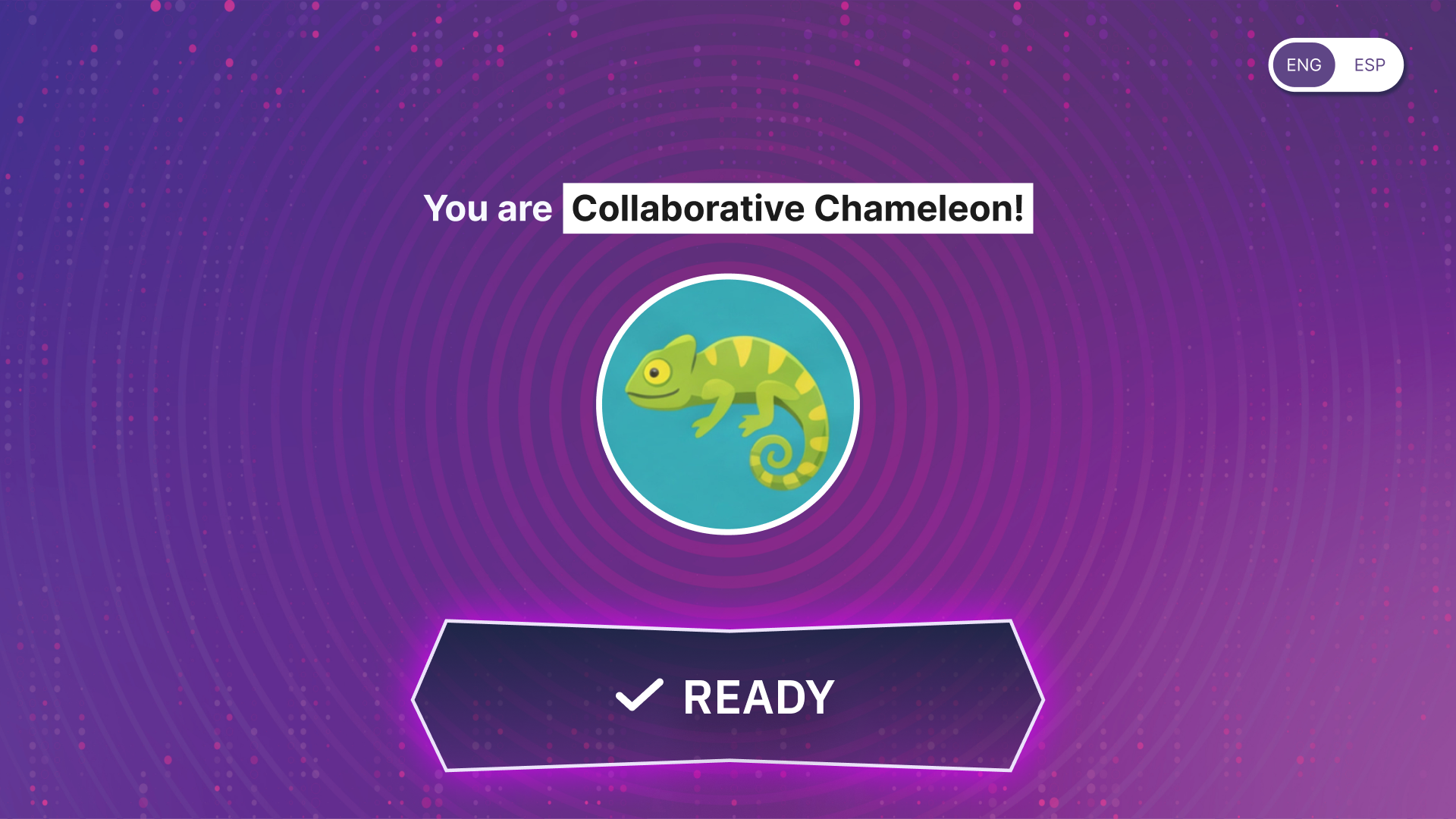
Keep only what’s necessary to register.
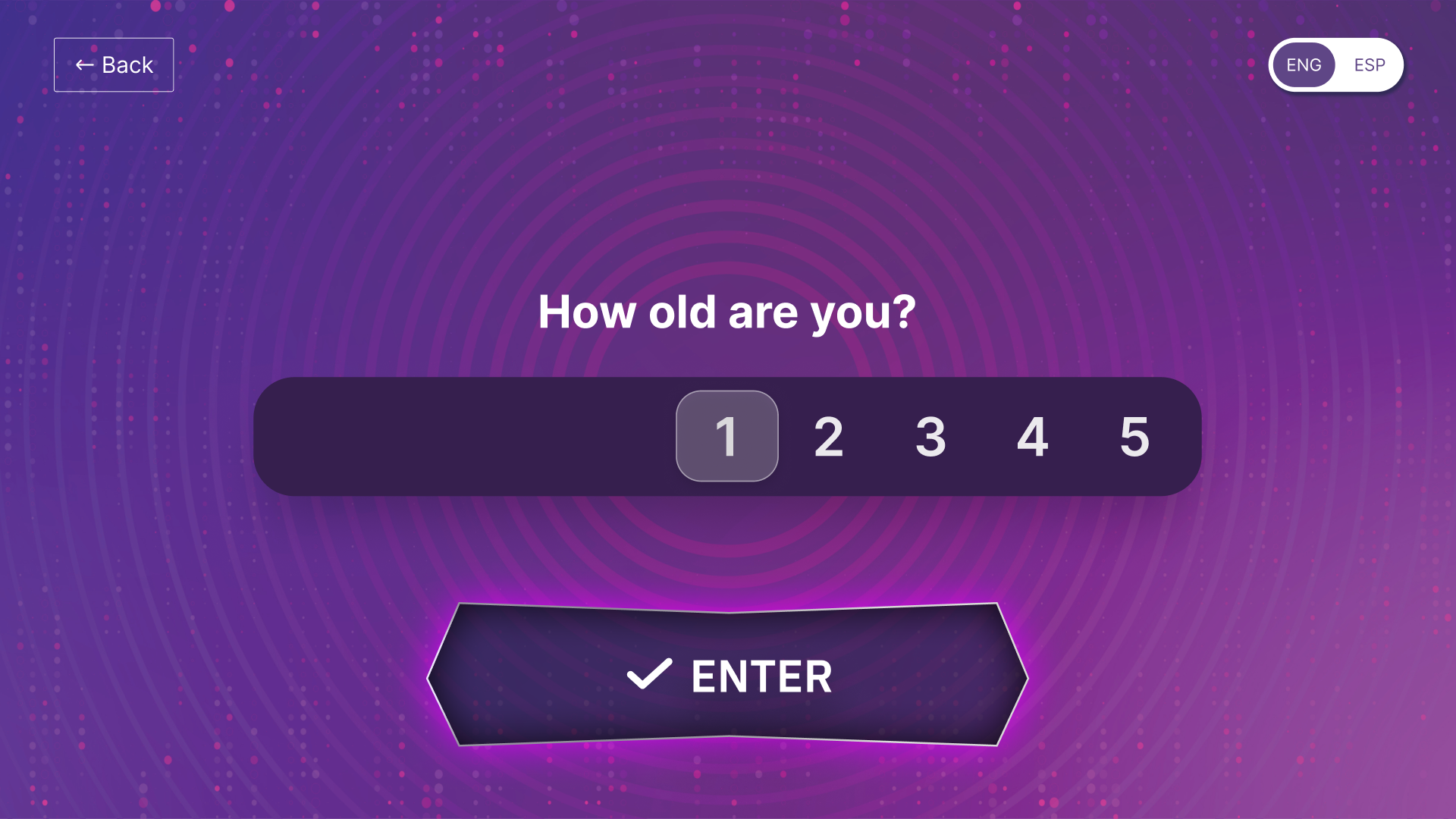
Age for data collection
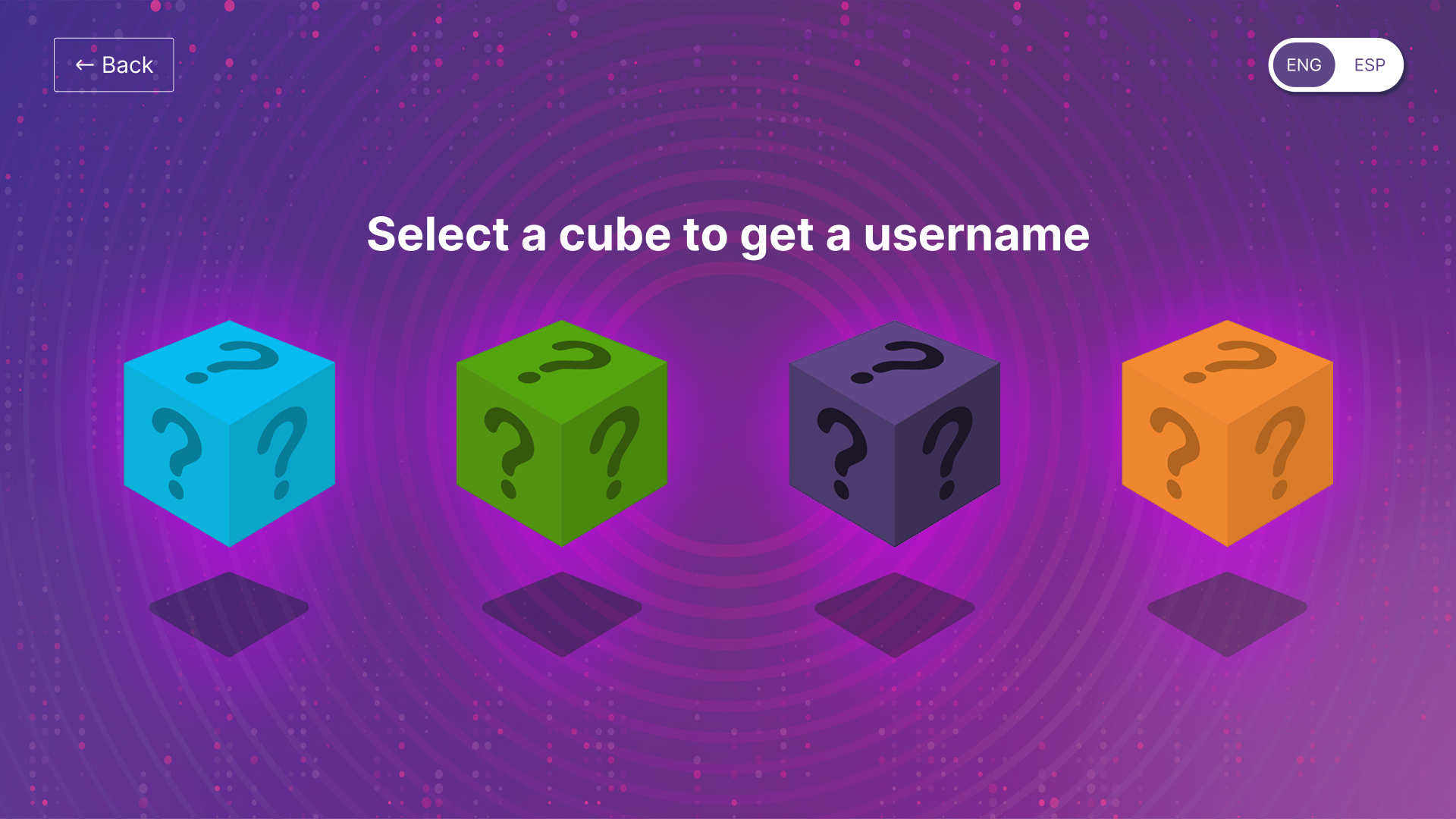
Selecting Username
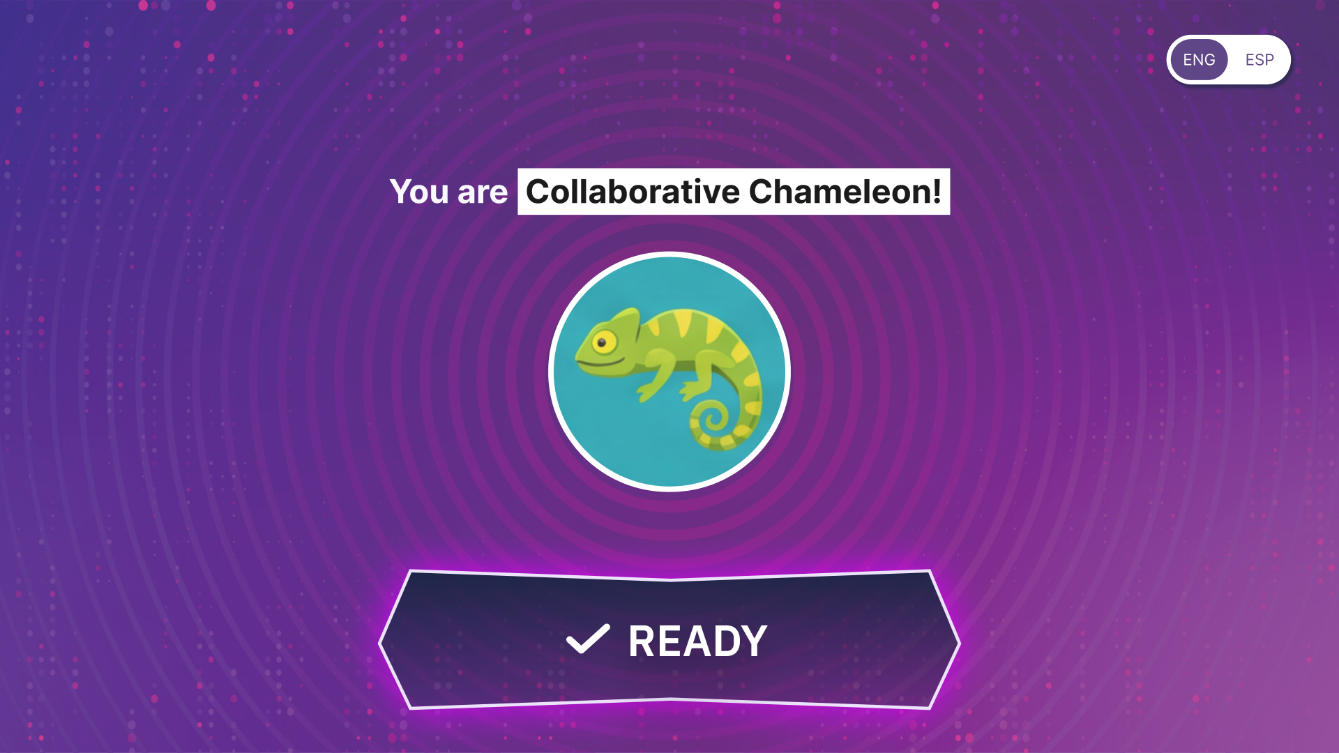
Selection Confirmation
Environmental distractions compete for attention.
We saw this a lot in testing. Kids were interested in everything BUT the screens. Even at super lo-fi, the game in front of them immediately stole their attention.
Which means it’s definitely happening in the real, polished exhibit!
Our answer?
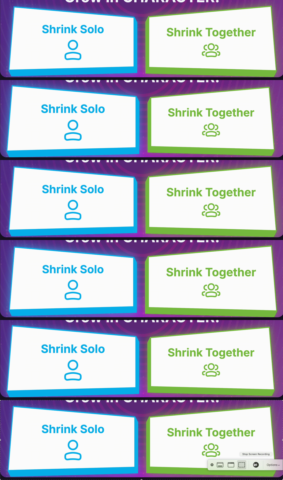
Make key CTAs as unmissable as possible.
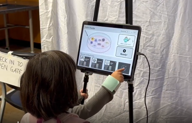
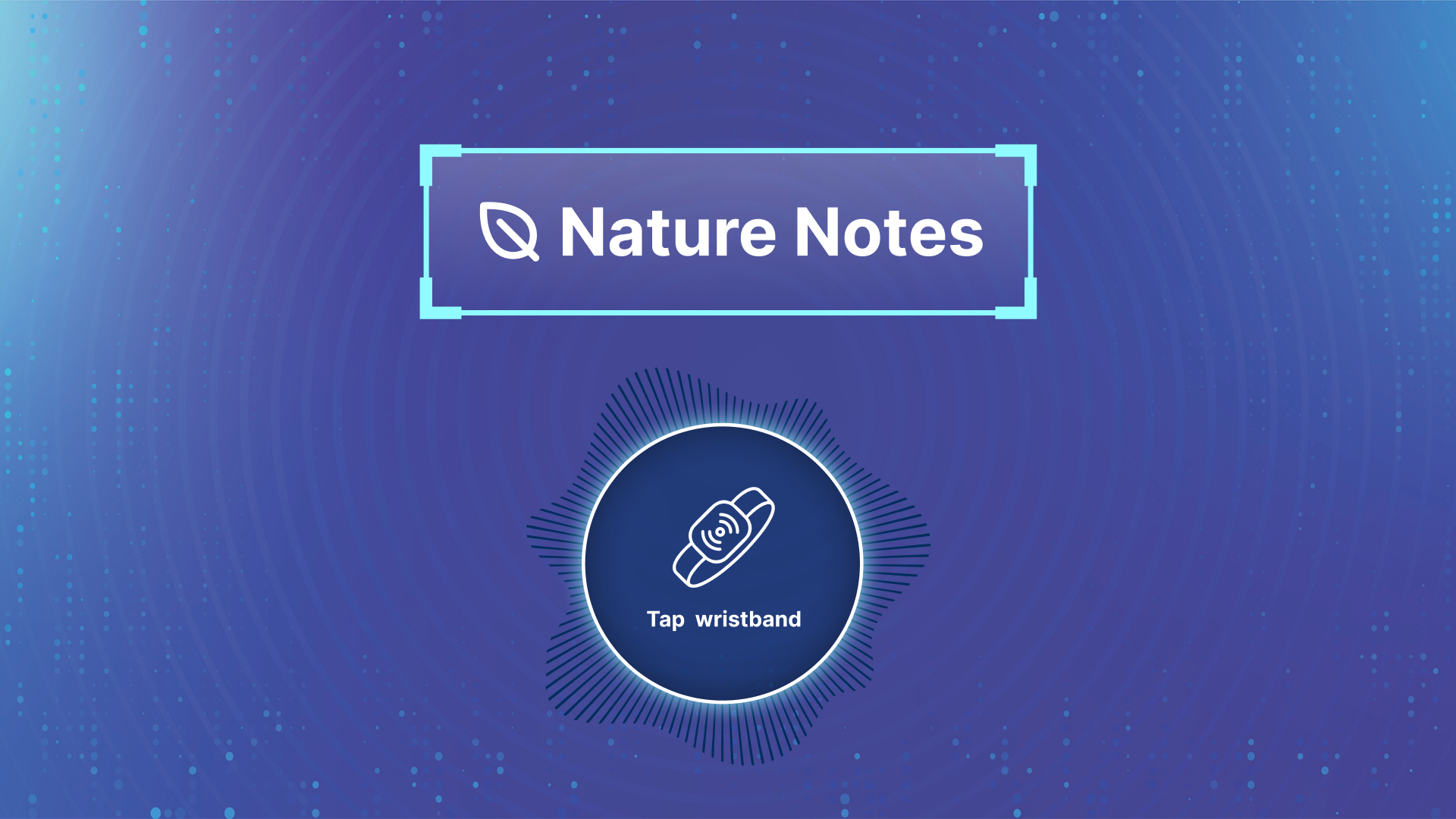
Game Check-in standby screen,

Enter screen for when the game is ready,
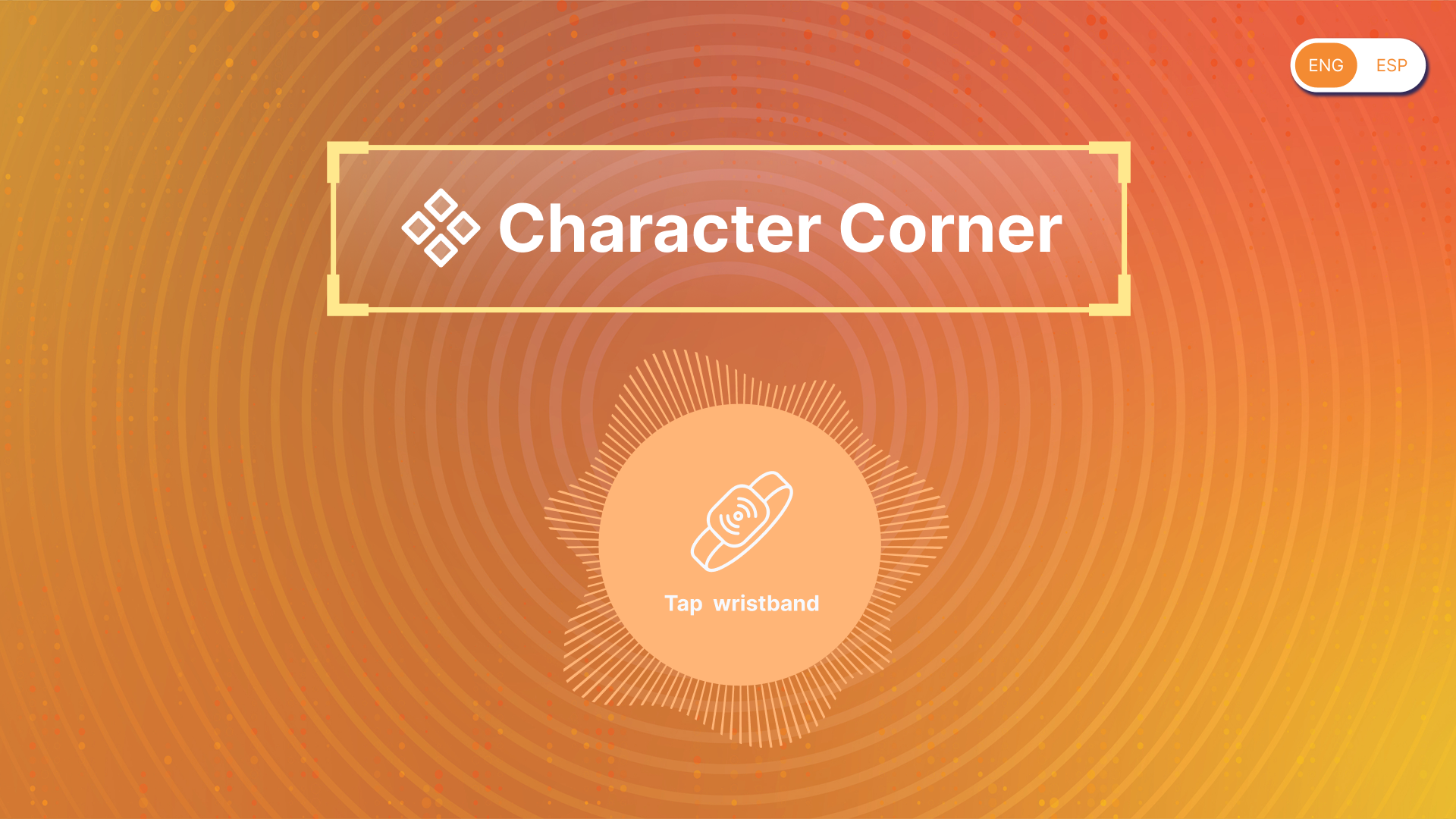
Contribution Kiosk standby screen,

We kept things so simple,
that it wasn’t distracting from the goal.
But still detailed enough to fit in with the physical environment!
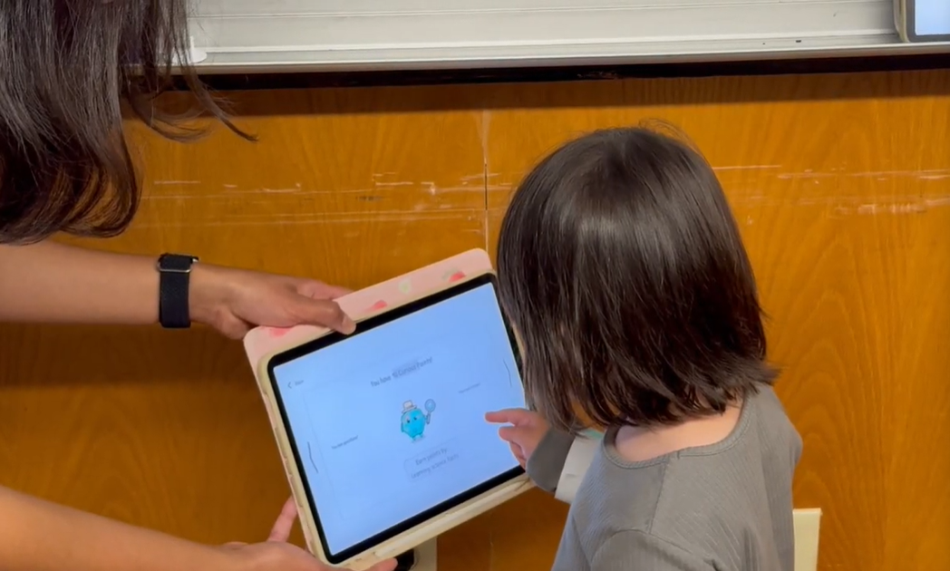
Kids learn through play!
Tried to find a balance in text instructions. We tested A LOT around how much information kids actually needed. How much do we explain upfront, and how much do we leave for them to figure out through play?
We tried everything. Text-heavy, no text, iconography, and everything in between to find that sweet spot.
The catch?
Doing the thing taught them more than explaining the thing.
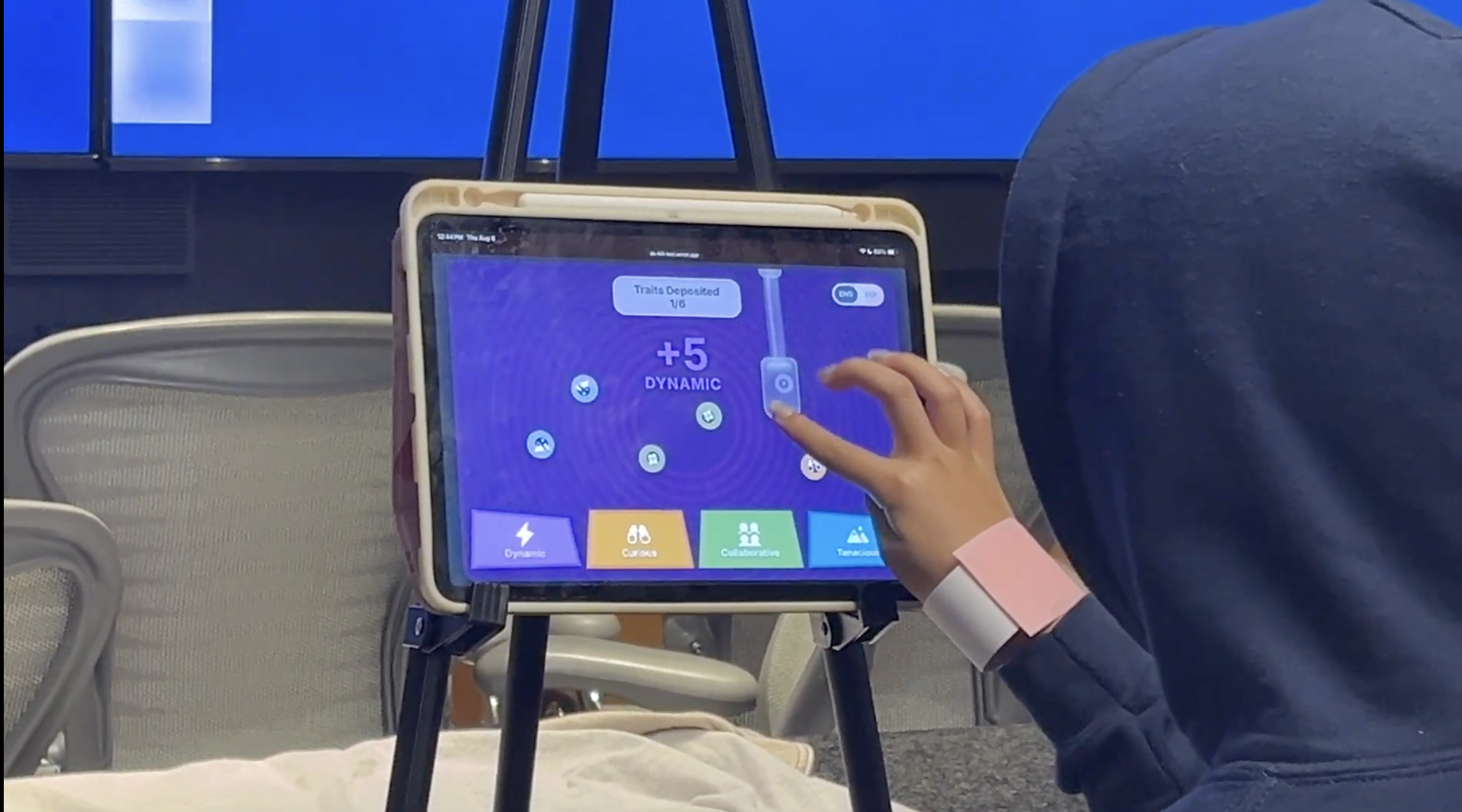
Minimal instruction, Users “vacuum” points.
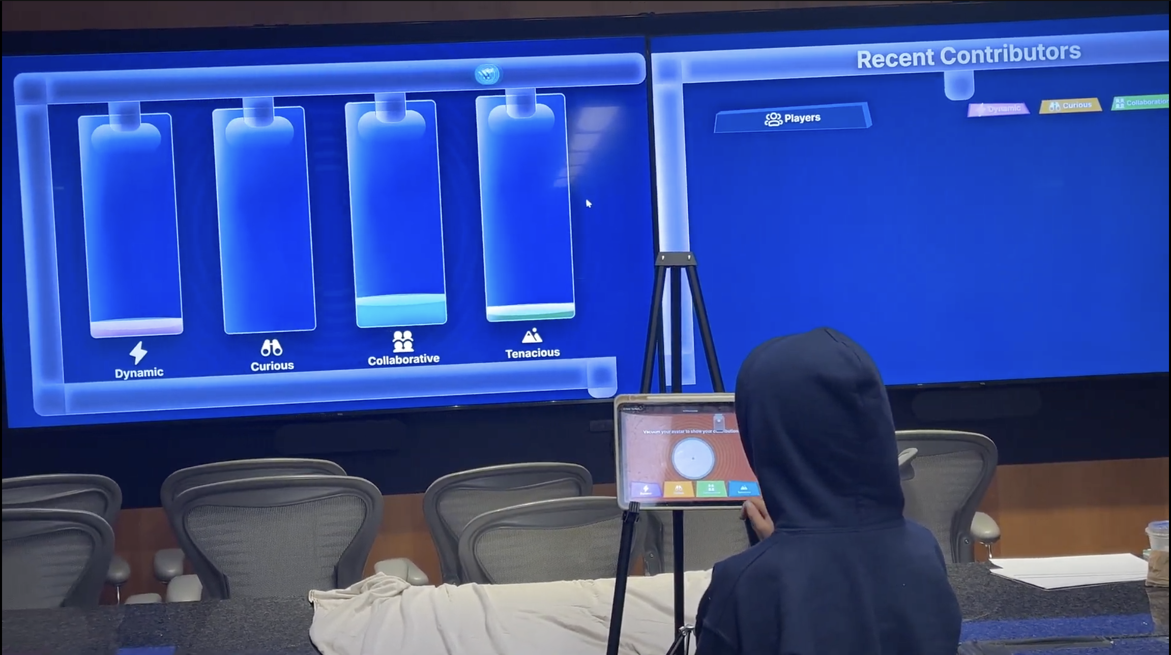
Visually, the response are tanks filling up each time they “vacuum” the traits.

Doesn’t make sense, right?!
(it’s the common theme when designing for kids it seems!)
This is the cherry on top!
Taking this to the home stretch!
More juicy details incoming.
MANAGING USER MOTIVATION
One of the biggest questions we continuously asked from the start to the very end is “how do we get kids interested in learning about these broader abstract concepts?”. Much of that was revealed in the research and testing, but common themes that helped ground us were:
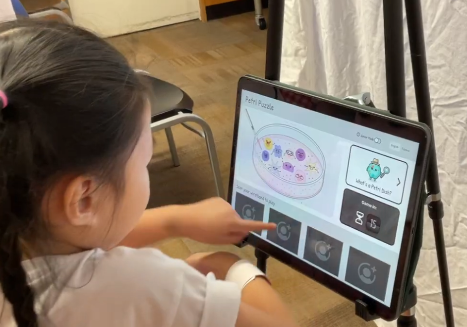
If it catches their eye, they’re more motivated to engage
We discovered this one almost by accident! During mid-fi A/B testing, some elements became more visually striking than their grayscale counterparts, and everyone’s attention immediately went to them.
The funny part? “Learn More” was only a secondary action.
That gave us an idea:
If visual stimulation naturally pulls kids in, we could use it intentionally to motivate exploration and engagement.
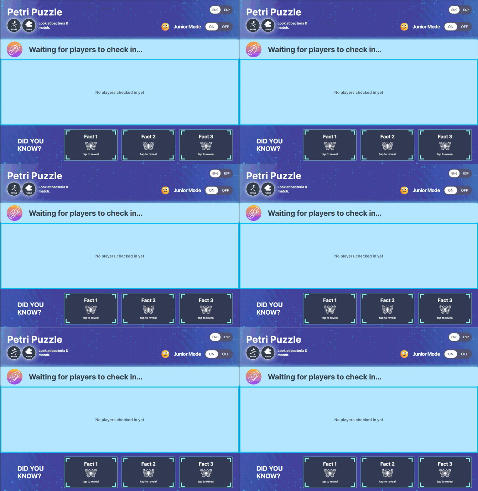
“Learn More” in Game Check-In wiggles in intervals to draw attention without taking too much away from primary check-in focus.
Onboarding has subtle grow and shrink animation to indicate it’s a button without it being too oversimulating.
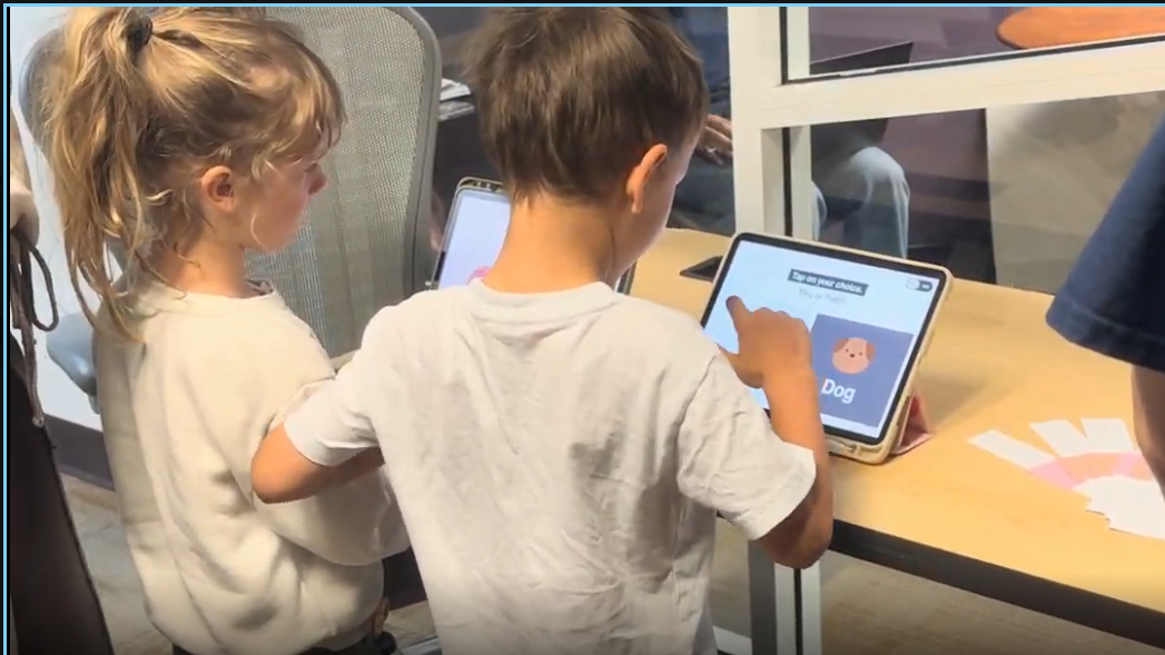
Let them choose, and they’re more invested in what happens next.
Small choices matter The usernames were preassigned, but that didn’t mean the experience had to feel that way. We found that even just influencing the outcome was enough to get kids invested.
So we heightened this feeling further.
Give the kids full autonomy to pick their own outcomes.
Before (Mid-fi)
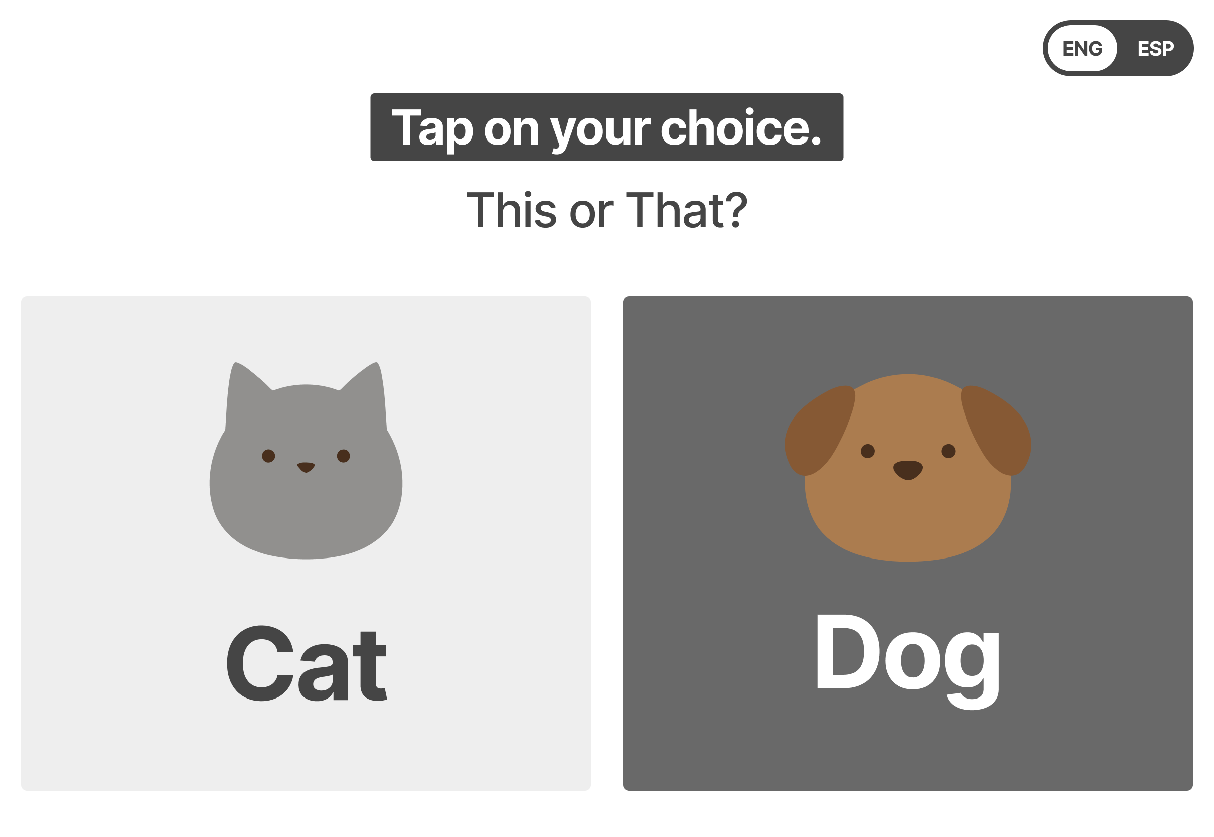
Users would select one or the other to help determine what username best suits them.
It wasn’t clear that this choice influences their username.
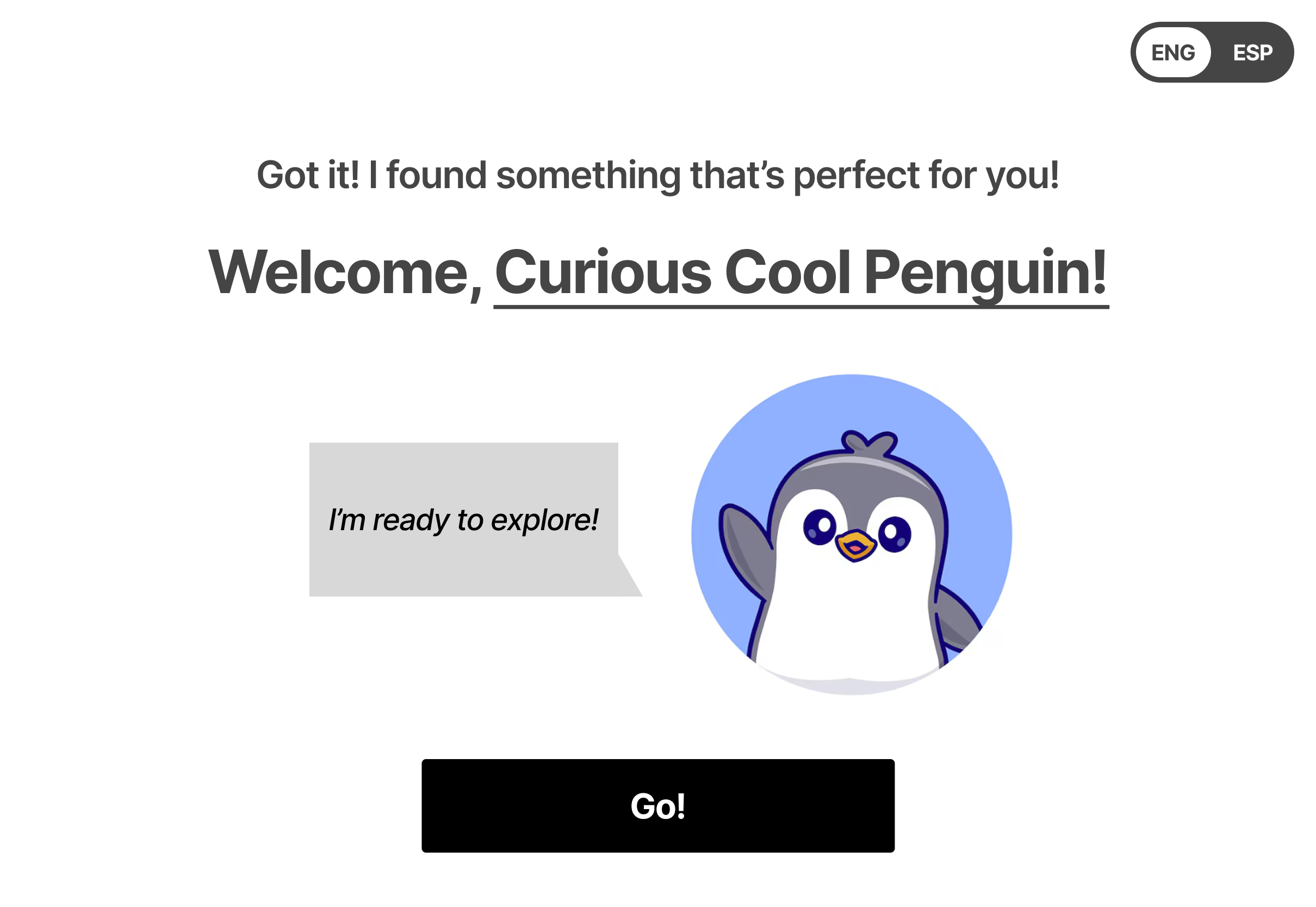
After (Current)
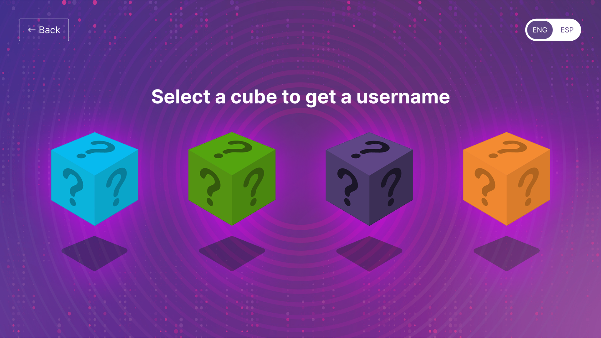
Now users know their choice here directly influences the outcome.
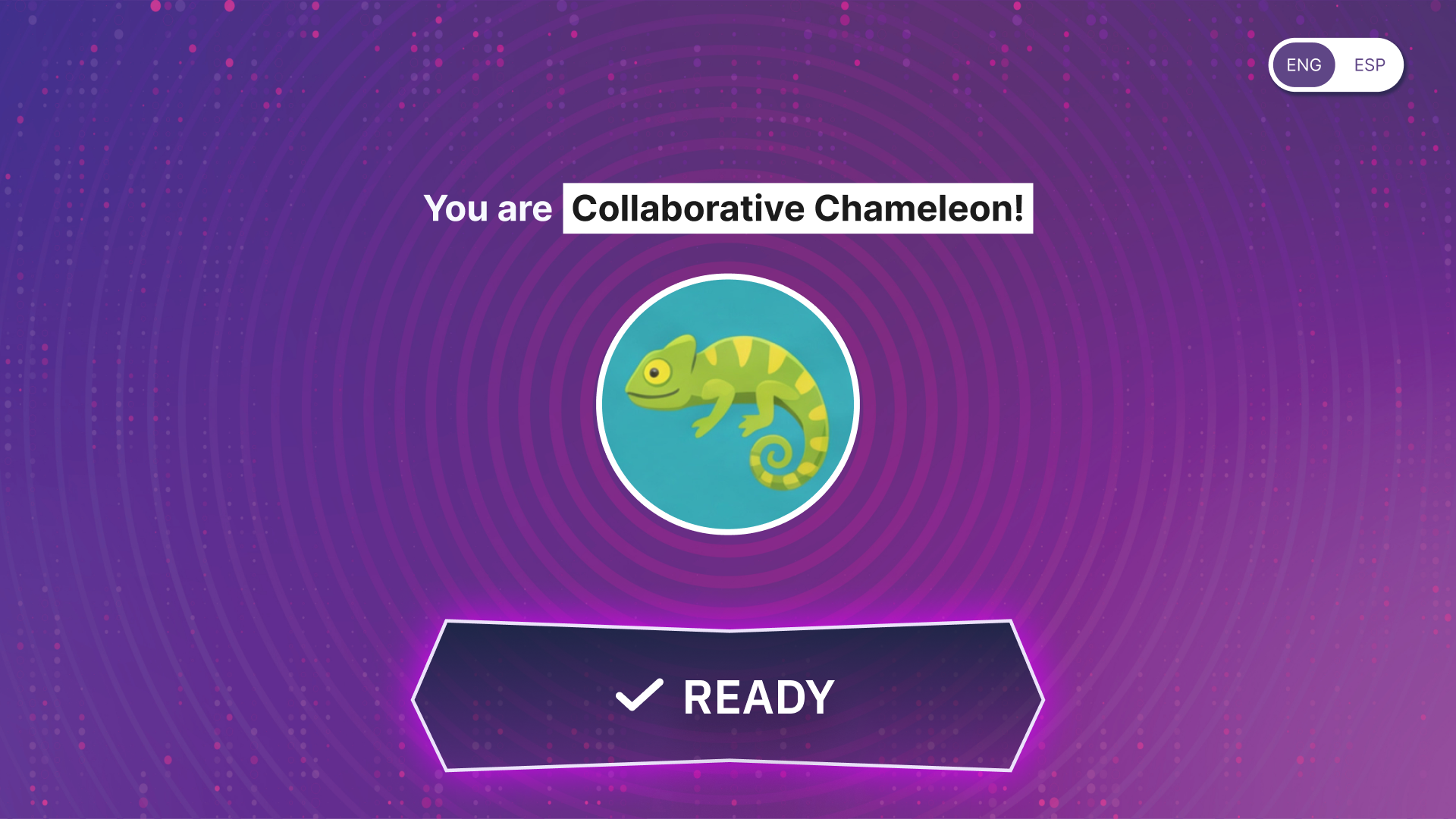
Making it much more clearer on the influence they have.


Testing strengthened our designs, while the workshops I designed strengthened our partnership—keeping Discovery Cube involved, aligned, and heard throughout the process.



Providing Discovery Cube visibility into where our research and design stood

Opening conversations for feedback throughout the process

To align and constantly stay aligned in our on our goals, gaps, and opportunities.

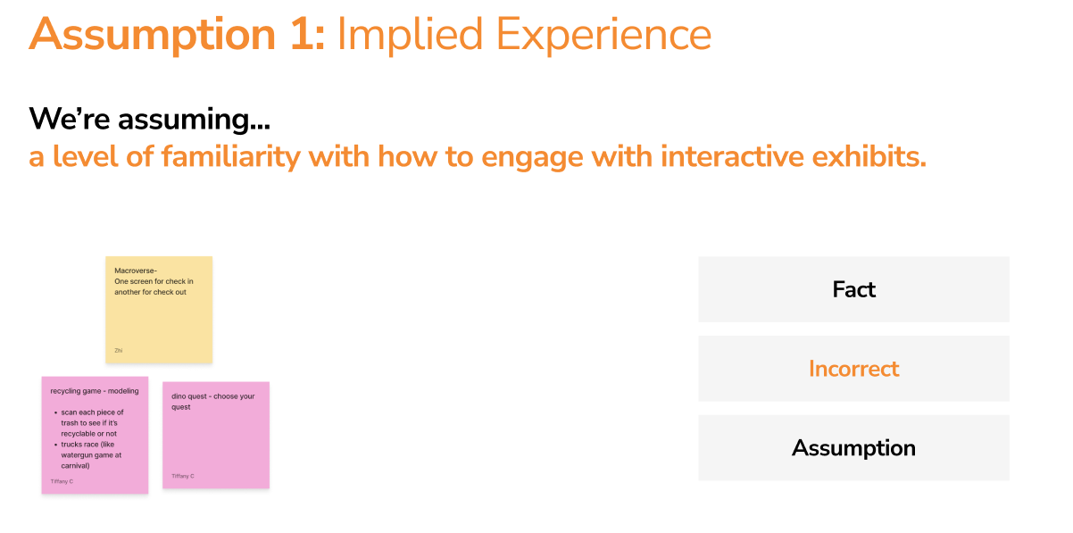
Goal: Understand what our partners knew, what neither of us knew yet, and where our team could step in with our own expertise.
How it works: Present a series of assumptions and discuss whether each is a known fact, incorrect, or something that needs further research.
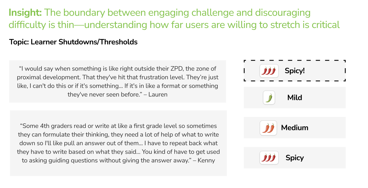
Goal: Understand which findings our partners expected, were curious about, or found surprising—helping us distinguish what genuinely excited them from what simply felt expected.
How it works: Present a series of insights and rate their “spice level” based on how surprising they felt: Mild (expected), Medium (somewhat unexpected), or Spicy (very unexpected).

The end, already?!
20 weeks flew by so fast T^T
But, excited to see the project launched in May 2027 ! (I will be at the ribbon cutting!)
AS AN INDIVIDUAL
Going into this project, I was nervous about working with kids because my experience was limited. But it’s helped me realize how adaptable I can be! From learning to shift how I communicate depending on whether I’m working with kids, guardians, or completely different age groups, meeting people where they’re at feels like a huge addition to my toolkit moving forward.
AS A PROFESSIONAL
Realizing just how adaptable I can be! NOTHING about this project was certain. Things were constantly changing, and we had to adjust to new asks, findings, and needs on the go. I’m proud of my own ability to navigate that, but a lot of credit goes to my team too. We were all able to pivot together and somehow keep things moving forward.
Quick FYI !
This site is currently under a huge revamp, so it is optimized for desktop/laptop viewing. Sorry for the inconvenience!